Recruiters don’t read resumes like a novel—they skim. The Ladders’ eye‑tracking research found the average initial screen was 7.4 seconds (2018). Confidence: High (primary PDF + independent coverage).
Sources: The Ladders Eye‑Tracking Study (PDF), HR Dive summary
That’s why choosing the right resume font in 2026 isn’t about aesthetics—it’s about reducing parsing risk (ATS/resume scanners) while maximizing human readability (the 7‑second skim).
In this guide, you’ll learn:
- The safest ATS-friendly fonts for 2026 (and which “modern” fonts are higher risk)
- How a resume scanner (and ATS parser) extracts text—and where fonts can break it
- Best practices for font size, bold/italics, headings, bullets, and spacing
- The real “ATS killers” (columns, tables, headers/footers, icons) and what to do instead
- A 10-minute font + parsing test you can run with any resume
- Helpful tools (including JobShinobi) to keep formatting consistent while you tailor content
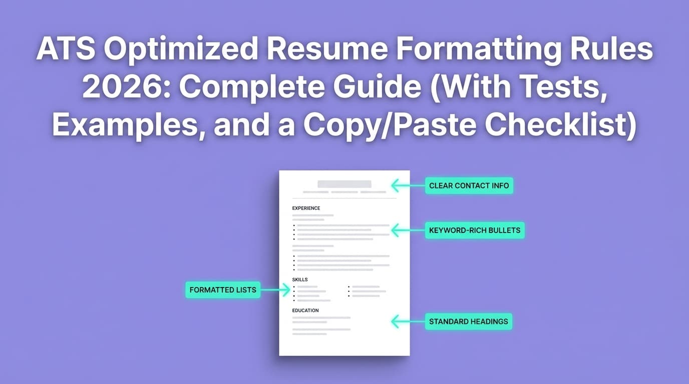
What “ATS-friendly fonts” means (and what it doesn’t)
An ATS-friendly font is a font that tends to:
- Render predictably across systems (Windows/Mac/browser PDF viewers)
- Extract cleanly to text (copy/paste and parsing tools don’t produce junk characters)
- Stay highly readable at typical resume sizes (10–12pt body text)
What it does not mean
- It does not guarantee you “pass ATS.” (ATS doesn’t accept/reject on font alone; it’s mostly about relevance, fields, and screening rules.)
- It does not mean serif fonts are “bad” or sans-serif are “always better.”
- It does not mean you should obsess over font over keywords and clarity.
Think of font choice as risk management: it’s one of the easiest ways to avoid accidental parsing problems.
What is a “resume scanner” (and why fonts matter)?
A resume scanner (job seeker tool) typically tries to mimic what an ATS does when it ingests your file. It usually performs some combination of:
- Text extraction (pulling raw text from PDF/DOCX)
- Layout interpretation (reading order: what comes first, second, etc.)
- Section detection (“Experience,” “Education,” “Skills”)
- Keyword matching (job description ↔ resume)
- Formatting checks (flagging columns, tables, headers/footers, icons, etc.)
Fonts matter primarily in step #1: text extraction, especially for PDFs. If the tool can’t extract text reliably, it can’t evaluate your resume accurately—and neither can many ATS parsers.
Why ATS-friendly fonts matter in 2026 (with real-world data)
1) ATS usage is common
A widely cited stat: 78% of HR professionals report using an ATS, per HR.com’s Future of Recruitment Technologies 2025–26 report page. Confidence: Medium (one source in this workflow; exact methodology may vary).
Source: HR.com – Future of Recruitment Technologies 2025–26
Many summaries also emphasize that Fortune 500 ATS adoption is extremely high. For example, Tufts’ career resources state that 98.4% of Fortune 500 companies use an ATS. Confidence: Medium (credible academic career center, but you should treat “Fortune 500 %” as a moving target year to year).
Source: Tufts Career Center – ATS overview
2) Humans still skim fast—even when ATS exists
Even if ATS parsing succeeds, you still need a recruiter or hiring manager to quickly understand your value. The Ladders’ 7.4‑second initial screen finding (above) is the clearest reminder that readability is not optional.
3) Career centers repeatedly warn that formatting (not “design”) breaks parsing
Multiple universities explicitly advise avoiding:
- tables
- columns
- headers/footers
- templates
- images/graphics
- fancy fonts / special symbols
Confidence: High (cross-validated across multiple independent university sources).
Sources:
- UIC Career Services (PDF): Ensure Your Resume Is Read – ATS
- Columbia Career Education: Optimizing your resume for ATS
- Princeton Career Development (PDF): Resume Guide
- UVA Career Center: Navigating ATS
- University at Buffalo: ATS-Friendly Résumés
The best ATS-friendly resume fonts for 2026 (the “Safe 6”)
If you want the lowest-risk font choices for resume scanners and ATS parsers, start here:
| Font | Type | Why it’s “safe” | Best for |
|---|---|---|---|
| Calibri | Sans-serif | Common default in Word for years; clean shapes; good readability | Most industries |
| Arial | Sans-serif | Extremely widely available; minimal parsing risk | Maximum compatibility |
| Helvetica | Sans-serif | Excellent readability; common on Mac (may substitute on Windows) | Modern look |
| Verdana | Sans-serif | Designed for screens; wide letterforms | Readability at 10–11pt |
| Georgia | Serif | Screen-friendly serif; strong readability | Traditional + readable |
| Cambria | Serif | Microsoft ecosystem; readable serif | More formal resumes |
If you’re unsure: choose Calibri 11 for body text and Calibri Bold 14 for section headings.
“Modern” fonts (Inter, Poppins, etc.): can they be ATS-friendly?
You’ll see newer fonts like Inter or Poppins recommended in modern resume design lists—especially for on-screen readability.
The honest answer
They can work—but they’re higher risk than system fonts unless:
- your PDF embeds the font correctly
- the text extracts cleanly
- you’re not using complex layout features
Many font guides emphasize legibility (e.g., Inter designed for screens), but ATS compatibility depends more on how your file is exported than what looks good in your editor. Confidence: Medium.
Practical rule: if you use a modern font, you must run the copy/paste test and ideally check font embedding (steps later in this guide).
What about Microsoft’s Aptos (Word’s newer default)?
Some resume blogs note that Aptos became Microsoft’s default font starting in 2024. Confidence: Medium (blog sources; verify based on your Word version).
Example source (informational): YesWriting – mentions Aptos as Word default since 2024
Should you use Aptos for ATS in 2026?
Likely fine in many cases, but it’s not as universally “battle-tested” as Arial/Calibri. If you use it:
- keep formatting simple
- export cleanly
- run the tests in this guide
Fonts to avoid (or treat as high risk) with resume scanners/ATS
Avoid fonts that increase the chance of text extraction problems or recruiter skepticism.
High-risk categories
- Decorative/script fonts (hard to read; more parsing risk)
- Display fonts (built for headlines, not body text)
- Ultra-light weights (poor print/scanning readability)
- Icon fonts (icons can extract as garbage characters)
- Fonts that require special installation (may substitute unpredictably)
“Unprofessional perception” fonts
Even if an ATS could read them, recruiters may not:
- Comic Sans
- Papyrus
The bigger truth: layout breaks ATS more than fonts
This matters because it prevents you from over-optimizing the wrong thing.
Many credible career resources emphasize simple formatting over “perfect font selection,” warning against tables/columns and other layout devices. Confidence: High (multiple university sources, listed above).
The most common failure mode
Your PDF looks perfect visually, but the parsing order becomes:
- right column → left column
- dates detached from roles
- skills blended into experience
- headings ignored (especially if they’re in text boxes)
A resume scanner usually flags these because they directly impact what an ATS “sees.”
ATS-friendly resume font size (2026): what actually works
Font size is a “Goldilocks” choice: too small hurts readability; too large wastes space.
Common recommended ranges
- Body text: 10–12pt (11pt is a common sweet spot)
- Section headings: 13–16pt
- Your name: 18–26pt (depends on layout)
Indeed’s resume guidance notes a typical resume font range between 10 and 12 points. Confidence: Medium (general guidance, not ATS-specific testing).
Source: Indeed – Best font for a resume (type and size)
UIC’s ATS-focused guidance also emphasizes reasonable font size and simple formatting. Confidence: Medium–High (career center PDF, ATS-focused).
Source: UIC ATS PDF
What to avoid
- Body text < 10pt (fails the skim test; can degrade if scanned)
- Light gray text (looks sleek; reads poorly)
- Overpacked lines (ATS might parse fine, humans won’t)
Bold, italics, underlines: ATS-safe styling rules
You can use styling, but keep it minimal.
Safe defaults
- Bold: section headings, job titles
- Italics: optional for company names or dates (sparingly)
- Underlines: usually unnecessary
Avoid
- Shadow, outline, text effects
- Excessive ALL CAPS
- Decorative separators and symbols
Resume bullets and special characters: what breaks scanning?
Some scanners and ATS parsers can stumble on non-standard characters.
Jobscan’s formatting advice (from SERP snippets and formatting-mistakes guides) commonly warns against “non-traditional bullet points” (stars/diamonds/checkboxes). Confidence: Medium (Jobscan pages were not fetchable in-page in this environment, but the guidance is consistent across other sources too).
A practical, ATS-safe approach:
- Use standard bullets (•) or hyphens (-)
- Avoid unusual symbols (★, ◆, ➤)
A PCC ATS tip list (PDF) also warns against special characters. Confidence: Medium (single career center PDF).
Source: PCC ATS resume tip list (PDF)
Icons on resumes: are they ATS-friendly?
Many modern templates use phone/email icons. This is one of those “looks nice, costs you later” choices.
The Muse explicitly notes that ATS cannot read images, which means icons (as images) may be skipped or lost. Confidence: Medium–High (reputable career publication; general ATS capability varies).
Source: The Muse – Resume icons
Best practice: write contact fields in plain text:
- Phone: 555-555-5555
- Email: [email protected]
- LinkedIn: linkedin.com/in/name
If you must use icons (e.g., for design roles), keep them purely decorative and do not rely on them to convey critical info.
PDF vs DOCX for ATS in 2026: which is safer?
There’s no single answer because ATS capabilities vary and employer instructions matter.
Practical guidance
- DOCX: often easier for parsers to interpret structured text
- PDF: preserves layout, but depends on whether the PDF is text-based and exported well
Rule of thumb: if the employer allows both and doesn’t specify, DOCX can be “safer” for parsing; if they require PDF, ensure it’s text-based and embedded fonts are correct.
Also: many job portals parse your resume into fields—use that as a real-world test (steps below).
How to check if fonts are embedded in your PDF (important for resume scanners)
If fonts aren’t embedded, systems can substitute them—sometimes changing spacing or (rarely) text extraction behavior.
Quick check (Adobe Reader / Acrobat)
Open the PDF → File → Properties → Fonts. Embedded fonts usually show as “(Embedded)” or “(Embedded Subset).”
Confidence: High (supported by multiple technical help sources):
- Superuser – how to check embedded fonts
- Adobe Community – check font embedding
- Michigan Tech Grad School – how to determine embedded fonts
What to do if fonts are not embedded
- Re-export your PDF using a “best for printing” or “embed fonts” option (varies by tool)
- Use a more standard font (Calibri/Arial) and export again
- Re-run the extraction tests below
Ligatures (fi/fl) and weird character issues: an underrated parsing problem
Some resumes end up with odd extraction like:
- “office” instead of “office”
- “profile” instead of “profile”
This can happen due to ligatures (a typography feature that combines characters like “fi”).
In the wild, people report ATS checker results changing when ligatures are disabled. Confidence: Low–Medium (community anecdotes; real ATS behavior varies).
Example discussion surfaced in search: Reddit – ATS checkers and ligatures
Practical fix (especially in Word)
- Avoid fancy typography features
- Disable ligatures if your editor applies them
- Run the copy/paste test again after exporting
The 10-minute “resume scanner” test: verify your fonts + formatting quickly
You don’t need a paid tool to catch many of the biggest issues.
Test 1: Copy/paste extraction test (60 seconds)
- Open your PDF.
- Select all (Ctrl/Cmd + A), copy, paste into a plain text editor (Notepad/TextEdit).
Look for:
- scrambled order
- missing bullets
- broken characters (□, )
- merged words (“ProjectManager”)
- headings missing or duplicated
If this looks messy, a resume scanner/ATS parser may struggle too.
Test 2: “Portals parsing preview” test (3 minutes)
Many application systems show how they parsed your resume into fields.
Look for:
- job titles and companies swapped
- dates moved to wrong roles
- skills lost
- education misread
If the portal gets your basics wrong, simplify formatting and rerun.
Test 3: Font embedding check (2 minutes)
Use the PDF Properties → Fonts method above and confirm fonts are embedded.
Test 4: Reading order test (2 minutes)
If you used:
- two columns
- a sidebar
- tables for alignment
- text boxes
…assume risk. Convert to a single-column layout and retest.
University guidance strongly recommends avoiding columns/tables/text boxes for ATS compatibility. Confidence: High (UIC, Columbia, Princeton, UVA, Buffalo sources listed earlier).
Test 5: “Plain section headings” test (2 minutes)
ATS and scanners tend to perform best when headings are standard:
- Summary
- Experience / Work Experience
- Education
- Skills
- Projects
- Certifications
Avoid creative headings (“Where I’ve been,” “My journey,” “Toolbox”) unless your industry expects it.
Best practices: ATS-friendly fonts + formatting that actually moves the needle
1) Use one font family (two max)
- Body: one font
- Headings: same family (bold) or one additional family
More fonts = more complexity with minimal upside.
2) Choose readability over “space-saving”
Instead of shrinking to 9pt:
- cut weak bullets
- tighten line spacing slightly (without cramping)
- adjust margins modestly
- consider a second page if appropriate for your level
3) Avoid headers/footers for important info
Multiple career centers warn ATS may not read headers/footers reliably. Confidence: High.
Sources: Princeton PDF, UIC PDF, Columbia
4) Use a single column unless you have a compelling reason
If you’re applying through portals (most people are), single column is the safer choice.
5) Don’t rely on icons or graphics to convey information
ATS may ignore images/icons. Use text labels.
Common mistakes to avoid (with fixes)
Mistake #1: Two-column templates (especially with a sidebar)
Why it hurts: parsing order errors and scrambled content.
Fix: move sidebar info (skills/tools) into a single “Skills” section.
Mistake #2: Tables for alignment
Why it hurts: tables can confuse extraction and reading order.
Fix: use simple tabs or consistent spacing; if using LaTeX, avoid complex box/table layouts unless thoroughly tested.
Mistake #3: Contact details only shown as icons
Why it hurts: icons may be skipped by ATS (image content).
Fix: write “Email:” and “Phone:” explicitly.
Mistake #4: Fancy bullets and special characters
Why it hurts: extraction inconsistencies.
Fix: use standard bullets or hyphens.
Mistake #5: “Designed PDF” that’s actually an image
Why it hurts: ATS needs OCR, which is less reliable.
Fix: export a text-based PDF from Word/Docs/LaTeX and verify by copy/paste test.
Best ATS-friendly font pairings (simple, clean, scanner-safe)
Pairing A (lowest risk, modern)
- Headings: Calibri Bold
- Body: Calibri Regular
Pairing B (maximum compatibility)
- Headings: Arial Bold
- Body: Arial Regular
Pairing C (classic, readable)
- Headings: Georgia Bold
- Body: Georgia Regular
Pairing D (slightly elevated, still safe)
- Headings: Calibri Bold
- Body: Cambria Regular
Step-by-step: how to pick your best ATS font in 2026
Step 1: Pick your baseline font family
- If in doubt: Calibri or Arial
- If you want serif: Georgia or Cambria
Step 2: Set sizes
- Body: 11
- Headings: 14
- Name: 20–24
Step 3: Build a one-column structure
Use clear section headers.
Step 4: Export and test
Run:
- copy/paste extraction test
- font embedding check
- portal parsing test (when possible)
Step 5: Only then add light polish
Small improvements that don’t increase parsing risk:
- consistent spacing
- bold job titles
- subtle dividers (simple lines, sparingly)
ATS + resume scanners: myth-busting (so you don’t chase the wrong goal)
Myth: “ATS rejects 75% of resumes because of formatting”
Reality: Many sources repeat dramatic numbers, but strong evidence is inconsistent. Some experts argue that “ATS rejection” is often just normal screening and qualification mismatch, not a robot auto-rejecting on font choice. Confidence: Medium (varied claims across blogs; treat extreme percentages carefully).
Actionable takeaway: optimize for clarity + relevance first, then remove formatting risks.
Myth: “One font will make the ATS like you”
Reality: If your resume is missing required skills/keywords or doesn’t match the role, Arial won’t save it.
Where JobShinobi fits (helpful, accurate, not hype)
If you’re a high-volume applicant, the hard part isn’t picking Calibri once—it’s keeping your resume consistent while you tailor content and avoid formatting drift.
JobShinobi can help with:
- LaTeX-based resume building using templates, with in-app PDF compilation/preview (useful for creating structured, consistent output).
- AI resume analysis that provides ATS-oriented scoring and feedback.
- Job matching: compare your resume against a job description to identify keyword gaps and tailoring suggestions.
Pricing (accuracy requirement): JobShinobi Pro is $20/month or $199.99/year. The marketing copy mentions a 7-day free trial, but trial mechanics are not clearly verified in the available implementation—so treat the trial as “mentioned” rather than guaranteed.
Internal links: JobShinobi, Login, Subscription
Tools to help you validate ATS-friendly fonts and parsing
Use a mix of “real-world” checks and scanners:
- Plain text editor (free): fastest way to see if extraction is messy
- Application portal parsing preview (free): best approximation of real ATS parsing
- PDF font embedding check (Adobe Reader/Acrobat): prevents substitution issues
- Resume scanners (various): helpful for keyword + formatting flags
- JobShinobi: LaTeX resume workflow + AI analysis and job matching (paid subscription)
Key takeaways
- The best “safe” fonts for ATS in 2026 are Calibri, Arial, Helvetica, Verdana, Georgia, and Cambria.
- Font choice matters, but layout simplicity matters more (avoid columns/tables/headers/footers/icons).
- Always run a quick copy/paste test to see what an ATS/resume scanner may extract.
- If you use modern fonts (Inter/Poppins/Aptos), treat them as higher risk unless you verify embedding + extraction.
- Optimize for the parser and the 7‑second human skim.
FAQ (People Also Ask)
What is the best font style for an ATS-friendly resume?
Use a standard, highly readable font like Calibri or Arial. They’re widely supported and tend to extract cleanly.
What font should I use for ATS in 2026?
A safe default is Calibri 11 (body) with Calibri Bold 14 (headings). If you prefer serif, Georgia or Cambria are commonly used.
Does ATS read Times New Roman?
Often yes—Times New Roman is widely available. If you use it, keep the layout simple and test extraction. Many ATS issues come from columns/tables/text boxes, not Times New Roman itself.
Does font size affect ATS?
Mostly indirectly. ATS can parse text at many sizes, but too-small fonts hurt readability and can worsen OCR if the resume becomes image-based. Typical guidance is 10–12pt body text.
Are icons in a resume ATS friendly?
Icons that are images may be skipped by ATS. The Muse notes ATS cannot read images, so don’t rely on icons for critical information—use plain text labels instead.
Source: https://www.themuse.com/advice/resume-icons
How do I know if my PDF resume fonts are embedded?
In Adobe Reader/Acrobat: File → Properties → Fonts. Embedded fonts show as “(Embedded)” or “(Embedded Subset).”
Sources: https://superuser.com/questions/140613/how-do-i-know-if-the-fonts-in-a-pdf-file-are-embedded-or-not, https://blogs.mtu.edu/gradschool/2010/04/27/how-to-determine-if-fonts-are-embedded/
What’s the most ATS-friendly resume format?
A single-column resume with standard headings and minimal formatting is the safest. Multiple university career centers recommend avoiding tables, columns, headers/footers, and graphics for ATS parsing compatibility.
Sources: UIC PDF, Columbia, Princeton PDF, UVA, Buffalo (linked above)