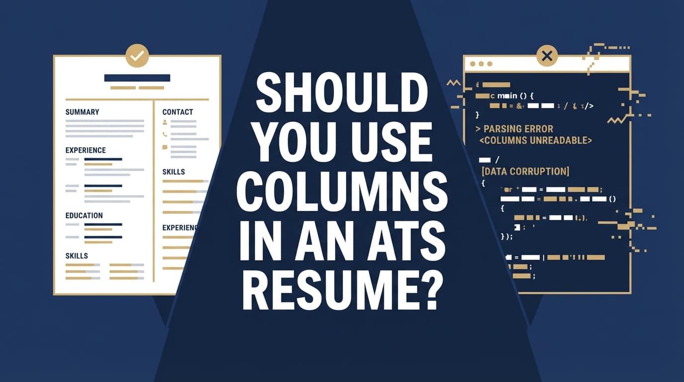
Two-column resumes look clean to humans—but they can be messy for software.
That tradeoff matters because ATS adoption is widespread: Jobscan reports 98.4% of Fortune 500 companies use an ATS (492 out of 500). (High confidence: Jobscan repeats this stat in multiple ATS-focused resources.)
Source: https://www.jobscan.co/state-of-the-job-search
And even when an ATS doesn’t “reject” you automatically, parsing errors can hurt your application: missing job titles, scrambled dates, or a skills section that ends up in the wrong place can make you look less qualified than you are.
Meanwhile, humans are scanning quickly. The Ladders’ eye-tracking research is often cited for showing recruiters spend about 7.4 seconds on an initial resume scan. (Medium–high confidence: widely cited; use the primary PDF.)
Source (PDF): https://www.theladders.com/static/images/basicSite/pdfs/TheLadders-EyeTracking-StudyC2.pdf
Secondary coverage: https://www.hrdive.com/news/eye-tracking-study-shows-recruiters-look-at-resumes-for-7-seconds/541582/
So the goal isn’t just “pass the ATS.” It’s: parse cleanly + read fast.
In this guide, you’ll learn:
- When resume columns actually cause ATS problems (and when they might be fine)
- A simple decision framework: Should you go one-column or two-column?
- How to test your resume for parsing issues in minutes
- Safer design alternatives (so you don’t have to choose between “ugly” and “ATS-friendly”)
What “columns” means in an ATS resume (and why it matters)
When people say “columns,” they usually mean one of these:
- True two-column layout (left sidebar + main content)
- Tables used to fake columns (common in Word templates)
- Text boxes positioned like columns
- Multi-column sections only (often the Skills section)
ATS software doesn’t “see” your resume like you do. It typically converts the document into a plain-text–like structure, then tries to identify sections (Experience, Education, Skills) and extract fields (company, title, dates, location).
Many career centers explicitly warn candidates to avoid columns/tables/text boxes because they can confuse parsing:
-
University of Virginia Career Center: “Avoid images, columns, tables, and graphics — these are difficult for ATS to read.” (High confidence: official university guidance.)
Source: https://career.virginia.edu/Students/Prepare/Resumes/NavigatingATS -
University of Minnesota Duluth: “ATS reads left to right across the page even with tables and columns.” (High confidence: official university guidance.)
Source: https://career.d.umn.edu/students/resume-cover-letter/applicant-tracking-system-ats-tips -
UIC Career Services (PDF) includes ATS-friendly checks such as single column and “no tables / multiple columns / text boxes.” (High confidence: official PDF.)
Source: https://careerservices.uic.edu/wp-content/uploads/sites/26/2017/08/Ensure-Your-Resume-Is-Read-ATS.pdf
Why columns can break ATS parsing (the mechanics, in plain English)
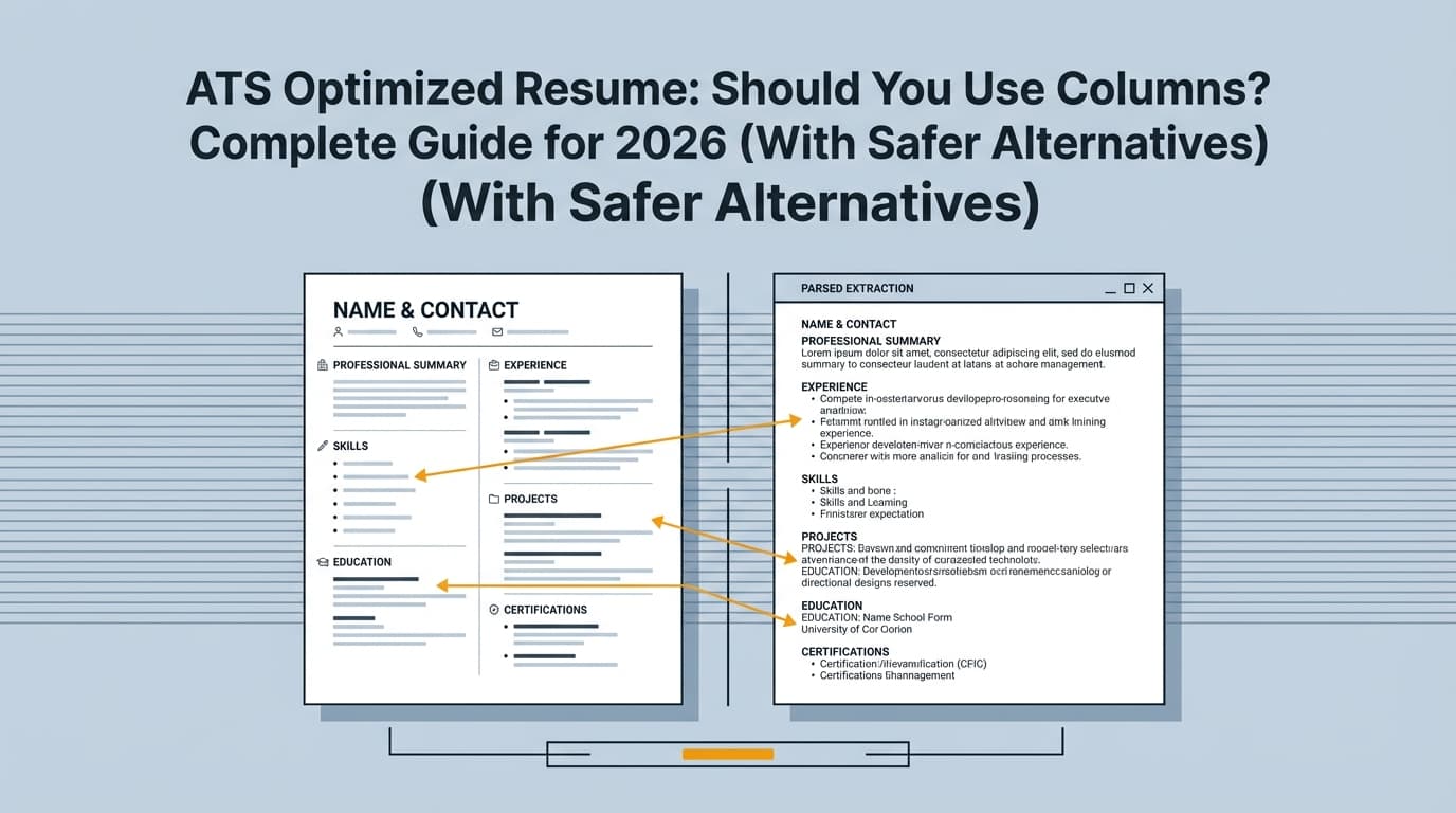
1) Reading order problems (scrambled content)
A human knows a sidebar is “secondary.” An ATS may read:
- Left column top-to-bottom, then right column top-to-bottom OR
- Across the page row-by-row (left cell then right cell) OR
- In a weird order depending on how the PDF was generated
Result: your Experience section can get interleaved with Skills, or dates can detach from roles.
2) Tables and text boxes are riskier than “native” columns
A key nuance: how you build the columns matters.
- Tables and text boxes often create “containers” that ATS tools don’t reliably interpret.
- Some systems handle simple Word layout columns better than table-based designs—but “better” is not the same as “safe everywhere.”
That’s why you see mixed advice online: some people say “two columns are fine now,” others say “never do it.” Both can be true depending on the ATS + file type + template construction.
3) “Important info” gets trapped in headers/footers/sidebars
Some templates put contact info in a header, or cram certifications into a sidebar. Many career centers warn against headers/footers specifically:
-
MIT CAPD notes ATS may struggle with “tables, columns, graphics, and images” and recommends simple formatting. (High confidence: official guidance.)
Source: https://capd.mit.edu/resources/career-toolkit-crafting-an-effective-resume/ -
UIC’s PDF warns against headers/footers and complex formatting. (High confidence.)
Source: https://careerservices.uic.edu/wp-content/uploads/sites/26/2017/08/Ensure-Your-Resume-Is-Read-ATS.pdf
So… should you use columns in an ATS resume? (The real-world answer)
The safest answer
If you want the lowest-risk option across ATS systems, do not use columns. Use a single-column layout.
This aligns with multiple university career services and ATS-focused guidance (see sources above).
The nuanced answer
You can sometimes use columns if:
- You’re confident most applications go to humans (portfolio/network referrals/creative roles)
- You can test your resume’s parsing output
- Your columns are built in a way that preserves reading order
- You’re willing to accept extra risk for visual design
The job-seeker reality check
If you’re a “high-volume applicant” sending dozens (or hundreds) of applications through job portals, your priority is usually:
Maximize parsing consistency and reduce weird edge cases.
In that situation, columns are rarely worth the risk.
Why this matters in 2026 (ATS is growing, and screening is still fast)
A few data points that explain why formatting decisions still matter:
-
ATS use is nearly universal among Fortune 500 companies (98.4%). (High confidence)
Source: https://www.jobscan.co/state-of-the-job-search -
Select Software Reviews summarizes ATS adoption as ~70% of large companies using an ATS (and lower adoption among smaller employers). (Medium confidence: credible industry blog compilation; treat as directional.)
Source: https://www.selectsoftwarereviews.com/blog/applicant-tracking-system-statistics -
The Ladders’ eye-tracking research is commonly cited for an average 7.4-second initial resume scan, reinforcing that clarity and predictable structure matters to humans too. (Medium–high confidence)
Source (PDF): https://www.theladders.com/static/images/basicSite/pdfs/TheLadders-EyeTracking-StudyC2.pdf -
HR Dive coverage reinforces that resumes capturing attention tended to have simple layouts and clear sections. (Medium confidence: secondary source summarizing the study.)
Source: https://www.hrdive.com/news/eye-tracking-study-shows-recruiters-look-at-resumes-for-7-seconds/541582/ -
Multiple universities explicitly recommend avoiding columns/tables/text boxes for ATS readability. (High confidence as institutional guidance)
UVA: https://career.virginia.edu/Students/Prepare/Resumes/NavigatingATS
UMD: https://career.d.umn.edu/students/resume-cover-letter/applicant-tracking-system-ats-tips
UIC PDF: https://careerservices.uic.edu/wp-content/uploads/sites/26/2017/08/Ensure-Your-Resume-Is-Read-ATS.pdf
MIT CAPD: https://capd.mit.edu/resources/career-toolkit-crafting-an-effective-resume/
How to decide: one-column vs two-column (simple framework)
Use this decision tree. If you hit any “High-risk” condition, default to one column.
Choose a single-column ATS resume if:
- You’re applying through online portals (Workday/Greenhouse/Lever/etc.) frequently
- You’re applying to large companies (more likely ATS-heavy)
- You’re targeting roles where ATS keyword search matters (most corporate roles)
- Your resume must parse cleanly for autofill forms
- You want “set it and forget it” formatting reliability
Translation: If your main pain point is “I’m getting filtered out,” go single column.
Consider a two-column resume only if:
- You’re in a design/creative field where layout is part of the evaluation
- Most opportunities come from networking, referrals, or direct emails
- You’re submitting a PDF directly to a person (and they prefer visual resumes)
- You will test the exact file you upload and confirm the parsing output looks right
Translation: If a human is guaranteed to see the original formatting quickly, you can “spend” some formatting risk.
How to test your resume for ATS parsing issues (5–10 minutes)
This is the most overlooked step. If you insist on using columns, testing is non-negotiable.
Step 1: Do a “plain text” reading order test
- Export your resume to the file type you submit (PDF or DOCX).
- Copy all text (Ctrl/Cmd + A, then copy).
- Paste into:
- Notepad (Windows) or TextEdit in plain text mode (Mac), or
- A blank Google Doc (paste without formatting)
What to look for:
- Does text appear in a logical order?
- Are job titles glued to the right companies?
- Do dates appear next to the correct roles?
- Are bullet points intact and under the right job?
If the order is wrong here, an ATS may also struggle.
Not perfect, but it’s a fast early-warning system.
Step 2: Test with a resume parser (form-fill simulation)
Many ATS flows include autofill. Upload your resume to any parser-style tool and inspect the extracted sections.
What to look for:
- Experience entries split incorrectly
- Skills missing or merged
- Education dates in the wrong place
- Contact info not recognized
Pro tip: Test both your PDF and DOCX. Some ATS configurations parse one better than the other.
Step 3: Run a formatting-focused ATS scan (not just keywords)
Keyword match is only half the battle. Formatting issues can prevent keywords from being recognized at all.
If you’re already using JobShinobi for resume work, you can use its AI resume analysis to get ATS-focused feedback (including formatting-related signals) and then iterate. JobShinobi also supports LaTeX resume editing with PDF preview/compile, which can help keep formatting consistent when you make changes.
(For pricing accuracy: JobShinobi Pro is $20/month or $199.99/year; the pricing page mentions a 7-day free trial, but trial mechanics aren’t confirmed in code.)
If you still want columns: how to make a two-column resume less risky
Not “risk-free.” Just less likely to break.
1) Avoid sidebars that contain critical info
If your left column contains:
- Job titles
- Company names
- Dates
- Core skills required by the job
…you’re gambling with the ATS extraction. Put essential content in the main flow of the document.
2) Don’t use text boxes for layout
Text boxes are among the most common causes of “invisible content” in parsers. If you used Canva or a highly designed template, there’s a high chance you’re actually using text boxes.
3) Be careful with tables (even invisible ones)
“Looks like columns” often means “table under the hood.” Many career centers warn against tables because of how ATS reads left-to-right.
If you can’t confirm how your template is built, assume it’s risky.
4) Keep section headings standard
Use headings an ATS expects:
- Summary
- Experience (or Professional Experience)
- Education
- Skills
- Projects
- Certifications
Avoid overly cute labels like “Where I’ve Been,” “Toolbox,” “My Journey,” etc.
5) Use a single-column core with a small “two-column” skills area (carefully)
If you’re trying to save space, a common compromise is:
- Single-column Experience + Education
- Skills listed in 2–3 short columns only if the parser test keeps order intact
If the skills section gets scrambled, revert it to one column with commas or bullets.
Examples: what can go wrong (and how to fix it)
Example 1: Scrambled experience due to a sidebar
What you designed:
- Left column: Skills + Certifications + Tools
- Right column: Experience + Education
What an ATS might parse:
- Skills list inserted between your company name and your bullets
- Certifications merged into job descriptions
- Tools list repeated mid-document
Fix:
- Remove the sidebar
- Put Skills in a normal section near the bottom
- If you need visual balance, use whitespace and consistent headings—not a separate text container
Example 2: Dates detach from jobs
What you designed:
- Company and role left
- Dates right-aligned in a second column
What an ATS might parse:
- Dates all grouped together
- Roles appear without timelines
Fix:
- Put dates on the same line in the main flow (e.g.,
Company — Title | 2022–2025) - Avoid layouts where dates live in a separate container
Example 3: Skills become unreadable (keyword loss)
What you designed:
- Skills in a tight 3-column table
What an ATS might parse:
Python AWS SQLTableauStakeholderManagement(words merged)- Or skills dropped entirely
Fix:
- Use bullets or comma-separated lists
- Keep spacing consistent and avoid special characters
Best practices checklist (ATS-safe formatting without looking “ugly”)
- Use one column for the main resume body (Experience/Education/Projects).
- Avoid tables, text boxes, and sidebars for critical content.
- Use standard headings (Experience, Education, Skills).
- Use a standard font and keep styling minimal (bold is fine; weird icons are not).
- Keep contact info in the document body (not header/footer).
- Be consistent with job entry structure (Title, Company, Location, Dates, Bullets).
- Test by copy/paste and parser upload before applying broadly.
- Optimize for humans too: clear hierarchy, tight bullets, measurable impact.
Common mistakes to avoid (columns are often bundled with these)
Mistake 1: Confusing “ATS-friendly” with “keyword-stuffed”
Formatting can be perfect and still fail because the content doesn’t match the role.
Fix: Tailor your resume to the job description (skills + keywords + priorities), but keep it readable.
Mistake 2: Using a Canva-style template and exporting to PDF
Highly designed templates are often built from text boxes and layered elements.
Fix: Use a simpler document tool (Word/Google Docs) or a structured resume system that outputs consistent PDFs.
Mistake 3: Hiding important info in headers/footers
Some ATS and parsers ignore them or extract them inconsistently.
Fix: Put name + contact info at the top of the main document body.
Mistake 4: Columns used to cram too much into one page
A two-column resume can become dense and harder for humans to skim—especially under time pressure (see the 7.4-second scan research).
Fix: Cut weaker bullets, tighten language, and prioritize impact.
Tools to help with ATS-safe resume formatting (and how to use them responsibly)
You don’t need 10 tools—but you do need a reliable workflow.
-
JobShinobi: Build resumes in LaTeX (structured formatting), compile to PDF, and run AI resume analysis for ATS-focused feedback. It also supports job description extraction and resume-to-job matching to spot keyword gaps.
Pricing: JobShinobi Pro is $20/month or $199.99/year. The pricing page mentions a 7-day free trial, but treat trial availability as unverified. -
Basic “paste test” tools: Notepad/TextEdit/Google Docs (free) to check reading order quickly.
-
Resume parser tools: Useful to preview what an ATS might extract—just remember results vary by ATS.
Important: No scanner can perfectly simulate every ATS configuration. Use tools as diagnostics, not as absolute truth.
Key takeaways
- If you want the safest ATS outcome, don’t use columns. Single-column is the most reliable across systems.
- Columns often break ATS parsing due to reading order and layout containers (tables/text boxes/sidebars).
- If you insist on two columns, test your file (plain-text paste + parser upload) before applying widely.
- The best resume is both machine-readable and human-scannable—simple formatting helps with both.
FAQ (People Also Ask)
Is a single-column resume better for ATS?
Yes—single-column resumes are generally safer for ATS parsing because they preserve a predictable top-to-bottom reading order. Multiple university career centers recommend avoiding columns for ATS readability.
Sources: UVA https://career.virginia.edu/Students/Prepare/Resumes/NavigatingATS, UIC PDF https://careerservices.uic.edu/wp-content/uploads/sites/26/2017/08/Ensure-Your-Resume-Is-Read-ATS.pdf
Can ATS detect two columns?
An ATS doesn’t “detect” columns like a human; it extracts text and attempts to interpret structure. Two-column designs can lead to text being read in the wrong order or grouped incorrectly—especially when columns are built with tables or text boxes.
Are columns in Word ATS-friendly?
Sometimes, but not reliably. “Native” Word formatting may parse better than table-based columns, but outcomes vary by ATS and by how the document is exported. If you use columns, you should test the exact file you submit.
Can ATS read tables in a resume?
Not reliably. Many career centers advise avoiding tables because ATS may read them left-to-right in ways that scramble meaning.
Source: UMD notes left-to-right reading even with tables/columns: https://career.d.umn.edu/students/resume-cover-letter/applicant-tracking-system-ats-tips
Should you use columns in a resume for creative roles?
If a human is likely to review your resume directly (portfolio-driven roles, referrals, email submissions), a two-column layout can be acceptable—but you’re still taking on parsing risk for ATS-based submissions. A safer approach is maintaining an ATS-safe single-column version and a designed version for direct sharing.
What’s the best resume layout for ATS in 2026?
A clean, single-column layout with standard headings (Experience, Education, Skills), minimal styling, and no text boxes/tables/graphics is still the most broadly compatible approach. ATS use remains widespread (e.g., Jobscan’s Fortune 500 stat), so consistency matters.
Source: https://www.jobscan.co/state-of-the-job-search
How do I quickly test if my resume columns break ATS parsing?
Copy/paste your resume text into plain text (Notepad/TextEdit). If the order is scrambled there, it’s a red flag. Then upload the resume to a parser-style tool and verify extracted Experience/Education/Skills fields look correct.