If your resume is getting “rejected by ATS,” your first instinct is usually to swap fonts, rewrite everything, and pray.
In reality, fonts matter—but only in one specific way: whether your resume stays machine-readable (for parsing) and human-readable (for skimming) after you upload it.
Here’s why this is worth taking seriously:
-
Jobscan reports it detected an ATS for 97.8% of Fortune 500 companies (489 out of 500) in 2025. (Source: Jobscan; Confidence: Medium — vendor research, but widely cited and specific.)
https://www.jobscan.co/blog/fortune-500-use-applicant-tracking-systems/ -
MIT Career Advising warns that if a font isn’t commonly used, ATS software may try to convert it and inadvertently “delete or ignore critical information.” (Source: MIT CAPD; Confidence: High — university career center guidance.)
https://capd.mit.edu/resources/make-your-resume-ats-friendly/ -
Recruiters may skim fast. The well-known Ladders eye-tracking research is often summarized as an average ~7.4 seconds spent on an initial resume scan, and HR Dive repeats this number in its coverage. (Sources: TheLadders PDF + HRDive; Confidence: Medium — older study, but directionally consistent.)
https://www.theladders.com/static/images/basicSite/pdfs/TheLadders-EyeTracking-StudyC2.pdf
https://www.hrdive.com/news/eye-tracking-study-shows-recruiters-look-at-resumes-for-7-seconds/541582/
In this guide, you’ll learn:
- The best fonts for ATS resumes in 2026 (safest first)
- Recommended ATS-friendly font sizes (with university + major career-site sources)
- The ATS font stress test (so you stop guessing)
- Font pairings that look modern but stay low-risk
- Common mistakes that get blamed on fonts (but are really layout/format issues)
What is an ATS-friendly resume font?
An ATS-friendly font is a typeface that is:
- Commonly supported (installed on most systems, or safely embedded in your PDF)
- Easy to extract as text (when an ATS converts your resume to plain text)
- Visually readable at 10–12 pt in a single-column layout
“ATS-friendly” does not mean “magic font that gets interviews.” It means your job titles, dates, and skills don’t get mangled during upload.
Why fonts matter for ATS in 2026 (and what actually breaks parsing)
ATS doesn’t “see” your resume like a human
Most ATS workflows involve:
- converting a PDF/DOCX into text
- mapping text blocks into fields (name, experience, education, skills)
- ranking or searching by keywords and structured data
That’s why fonts can matter—because some fonts and exports create messy text extraction.
The bigger issue is usually formatting (columns, tables, icons)
Many ATS guides emphasize that design elements can scramble reading order:
-
MIT advises avoiding tables/text boxes and keeping formatting ATS-friendly. (Confidence: High.)
https://capd.mit.edu/resources/make-your-resume-ats-friendly/ -
Jobscan has dedicated guidance on tables/columns and other formatting mistakes. (Confidence: Medium — vendor content but consistent with broader best practices.)
https://www.jobscan.co/blog/ats-formatting-mistakes/
https://www.jobscan.co/blog/resume-tables-columns-ats/
The best fonts for ATS resumes 2026 (ranked by compatibility)
Below is a practical tier system:
- Tier 1 (Safest): default/system fonts with maximum compatibility
- Tier 2 (Very safe): common professional fonts, still low risk
- Tier 3 (Use carefully): modern web fonts—fine if you test and embed properly
If you’re a high-volume applicant submitting through ATS portals, Tier 1 is your friend.
Tier 1: Safest ATS-friendly fonts (choose one of these)
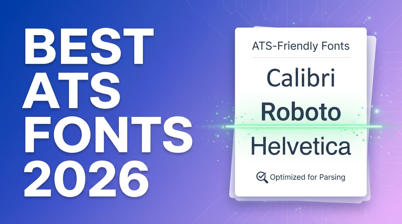
1) Calibri (sans-serif)
- Why it works: widely used, excellent readability, strong compatibility
- Microsoft lists Calibri among recommended resume fonts. (Source: Microsoft Word blog; Confidence: Medium.)
https://word.cloud.microsoft/create/en/blog/best-resume-fonts/
Best for: almost every industry
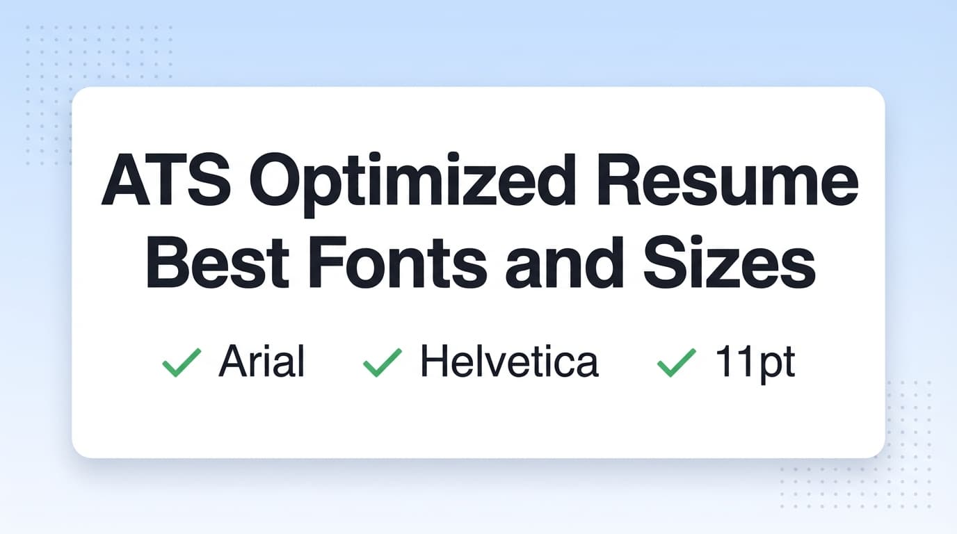
2) Arial (sans-serif)
- Why it works: extremely universal, plain-text extraction is usually clean
- Indeed recommends standard fonts like Arial for ATS resumes. (Confidence: Medium — mainstream career guidance.)
https://www.indeed.com/career-advice/resumes-cover-letters/ats-resume-template
Best for: maximum compatibility, “don’t overthink it” resumes
3) Helvetica (sans-serif)
- Why it works: clean and professional; common on macOS
Note: Helvetica can substitute on some Windows systems—test your export.
4) Verdana (sans-serif)
- Why it works: designed for screens, very readable
Tradeoff: takes more space (may push you to 2 pages if content is dense)
5) Tahoma (sans-serif)
- Why it works: compact and readable at smaller sizes
Best for: candidates trying to keep a tight one-page resume without shrinking below 10 pt
Tier 2: ATS-friendly fonts that still look polished
6) Cambria (serif)
- Common in Microsoft environments; often listed in ATS-safe font roundups (e.g., Jobscan). (Confidence: Medium.)
https://www.jobscan.co/blog/best-fonts-resume-ats-recruiter/
7) Georgia (serif)
- Microsoft includes Georgia in its resume font recommendations. (Confidence: Medium.)
https://word.cloud.microsoft/create/en/blog/best-resume-fonts/
8) Times New Roman (serif)
- Ultra-common and typically compatible
Tradeoff: can look dated and dense—use more spacing and shorter bullets.
9) Garamond (serif, test before you mass-apply)
- Popular because it’s space-efficient
Risk: font variants + PDF export differences can affect extraction.
Tier 3: Modern fonts (fine if you test)
These can look more modern:
- Roboto
- Open Sans
- Lato
- Inter
Figma’s guidance notes that you should avoid unusual characters and special ligatures because they can cause parsing challenges. (Source: Figma; Confidence: Medium.)
https://www.figma.com/resource-library/best-font-for-resume/
Rule: If you use a modern font, run the stress test below. No exceptions.
Fonts to avoid on ATS resumes (2026)
Avoid fonts that are:
- decorative/script/handwriting
- “display” fonts meant for posters
- icon fonts (glyphs that aren’t real letters)
Common examples:
- Comic Sans, Papyrus
- Brush Script and other cursive fonts
- Wingdings/Symbol fonts
- many Canva-style template fonts (often substituted or flattened in PDF)
Best resume font size for ATS in 2026 (with sources)
Multiple sources converge on the same range:
-
Indeed: suggests standard fonts in 10–12 pt for ATS-friendly resumes. (Confidence: Medium.)
https://www.indeed.com/career-advice/resumes-cover-letters/ats-resume-template -
University of Minnesota (CLA): recommends a common font in 10–12 pt, with name up to 18–22 pt. (Confidence: High — university guidance.)
https://cla.umn.edu/undergraduate-students/career-services/getting-job-or-internship/resume/resume-format -
UC Santa Barbara Career Services: explicitly says use a font size between 10–12 points and references ATS compliance. (Confidence: High.)
https://career.ucsb.edu/get-hired/resumes -
University at Buffalo (School of Management): suggests Arial/Calibri/Times New Roman and 10–14 pt (a broader range). (Confidence: High.)
https://management.buffalo.edu/career-resource-center/students/preparation/tools/correspondence/resume/electronic.html
Practical size settings that look good and scan well
If you want a safe default:
- Calibri 11 body, 13–14 headings
- Arial 11 body, 13–14 headings
- Georgia 10.5–11 body, 13–14 headings
Don’t shrink to 9 pt to “fit more”
MIT warns against shrinking font to cram content. (Confidence: High.)
https://capd.mit.edu/resources/make-your-resume-ats-friendly/
If your resume needs 9 pt, the fix is usually:
- tighter bullets (remove filler)
- fewer sub-bullets
- stronger prioritization
- cleaner spacing (not smaller text)
Serif vs sans-serif for ATS resumes: which is better?
ATS can parse both if your resume is text-based and exported cleanly.
Choose based on human readability and industry signal:
- Sans-serif (Calibri/Arial/Helvetica): modern, screen-friendly, clean
- Serif (Georgia/Cambria): traditional, formal
If you’re unsure, pick Calibri or Arial and move on.
PDF vs DOCX: does file type affect ATS parsing?
Many guides suggest DOCX is often easier for ATS to parse, while PDF preserves formatting better.
-
iHire notes Word documents are often preferred by ATS because they’re easier to parse than PDFs. (Confidence: Medium — general guidance, varies by ATS.)
https://www.ihire.com/resourcecenter/jobseeker/pages/is-it-better-to-send-a-resume-as-a-pdf-or-a-word-doc -
Resume Worded’s help center suggests PDFs can be fine if the text is highlightable (i.e., truly text-based). (Confidence: Medium.)
https://help.resumeworded.com/article/37-how-do-i-make-sure-my-resume-is-ats-compliant
Best practice: follow the employer’s instructions. If they accept either, submit a text-based PDF and keep a DOCX version ready.
The ATS font stress test (10 minutes)
This is how you stop guessing whether your font is “ATS safe.”
Step 1: Export both PDF and DOCX (if possible)
- PDF for formatting consistency
- DOCX for parsing friendliness
Step 2: Copy/paste extraction test (the fastest diagnostic)
Open the PDF → Select all → Copy → Paste into Notepad/TextEdit.
Pass: your resume stays readable and in order:
- contact info intact
- job titles + companies aligned
- dates not floating randomly
- bullets still look like bullets
Fail: scrambled sections, missing characters, weird symbols.
Step 3: Watch for ligatures and broken characters
Some fonts or exports can cause “fi/fl” and similar combos to extract strangely. Design guidance (like Figma’s) explicitly calls out ligatures as a possible parsing issue. (Confidence: Medium.)
https://www.figma.com/resource-library/best-font-for-resume/
If you see weird extraction:
- switch to Calibri/Arial
- re-export using your editor’s standard “Save as PDF” (avoid flattening)
- retest
Step 4: Run an ATS scan (optional)
Use a resume scanner to verify extraction. Don’t chase a perfect score—verify the ATS reads:
- headings
- experience entries
- skills list
- education
Font pairings (modern look, low risk)
Safest: one font throughout.
If you want a subtle pairing, keep it simple:
- Calibri (headings + body)
- Arial (headings + body)
- Cambria headings + Calibri body (classic + modern)
- Georgia headings + Calibri body (formal headings, clean body)
Avoid:
- 3+ fonts
- ultra-light weights
- decorative heading fonts
Common “font” mistakes that are actually formatting mistakes
Mistake 1: Two-column layouts
Even if some modern ATS can handle columns, they remain higher-risk than single-column for consistent parsing across systems.
Jobscan explicitly addresses tables/columns issues. (Confidence: Medium.)
https://www.jobscan.co/blog/resume-tables-columns-ats/
Fix: use a single-column layout.
Mistake 2: Tables for skills
Tables often scramble extraction.
Fix: write skills as comma-separated text or clean bullets.
Mistake 3: Icons for email/phone/location
Icons may be shapes or special glyphs.
Fix: use plain text labels.
Mistake 4: Headers/footers for contact info
Some ATS don’t parse headers/footers reliably.
Fix: keep contact info in the main body at the top.
Tools to help with ATS-friendly resumes (fonts + formatting + keywords)
JobShinobi (ATS-focused resume workflow)
When you want to keep formatting consistent while still improving ATS performance, JobShinobi can help you:
- build resumes using LaTeX templates
- compile LaTeX to PDF with an in-app preview
- get AI resume analysis with ATS-focused scoring and feedback
- match your resume to a job description (paste text or a URL) to identify keyword gaps
Pricing accuracy: JobShinobi Pro is $20/month or $199.99/year. The marketing site mentions a 7-day free trial, but trial enforcement isn’t clearly evidenced in code—so don’t assume it applies in every case.
Internal links you can use:
- Plans/subscription: /subscription
- Resume area: /dashboard/resume
Other helpful tools (for verification)
- Word/Google Docs export + copy/paste test (surprisingly effective)
- ATS resume scanners to confirm extraction (use for validation, not score-chasing)
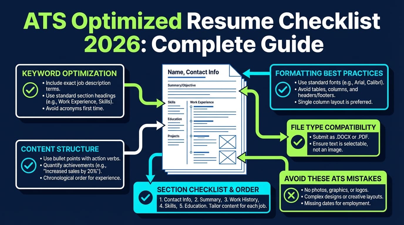
Best practices checklist (print this)
- Use Calibri or Arial if unsure.
- Keep body text 10–12 pt (supported by multiple university career centers).
- Use one font (or max two).
- Stick to black text (or very dark gray with strong contrast).
- Use a single-column layout.
- Avoid tables, text boxes, graphics, and icons.
- Use standard headings: Experience, Skills, Education.
- Export a text-based PDF (copy/paste test).
- Keep a DOCX version ready.
- Test parsing before sending 50 applications.
Key Takeaways
- The best fonts for ATS resumes in 2026 are the most compatible: Calibri, Arial, Helvetica, Verdana, Tahoma.
- For most candidates, 10–12 pt body text is the sweet spot (supported by multiple university career resources).
- Fonts rarely “fail ATS” by themselves—columns, tables, icons, and bad exports usually do.
- Run a quick ATS font stress test (copy/paste extraction) before you apply widely.
FAQ
What is the most ATS-friendly resume font?
Calibri and Arial are consistently the safest choices due to broad compatibility and clean extraction. (Confidence: High — consistent across Microsoft/Indeed/university guidance and ATS blogs.)
Is 10 pt font okay for an ATS resume?
Yes—many university career centers recommend 10–12 pt. If you use 10 pt, ensure spacing and readability stay strong. (Sources: UCSB, UMN; Confidence: High.)
https://career.ucsb.edu/get-hired/resumes
https://cla.umn.edu/undergraduate-students/career-services/getting-job-or-internship/resume/resume-format
Can ATS read Garamond?
Often yes, but it’s higher risk than Calibri/Arial because of font variants and export differences. If you use it, test the exported PDF’s text extraction. (Confidence: Medium.)
Is PDF or DOCX better for ATS?
DOCX is often easier to parse, while PDF preserves formatting. Use what the employer requests; otherwise, submit a text-based PDF and keep DOCX ready. (Confidence: Medium; Source: iHire + Resume Worded help.)
https://www.ihire.com/resourcecenter/jobseeker/pages/is-it-better-to-send-a-resume-as-a-pdf-or-a-word-doc
https://help.resumeworded.com/article/37-how-do-i-make-sure-my-resume-is-ats-compliant
Are two-column resumes ATS-friendly in 2026?
They’re still riskier than single-column layouts because reading order can scramble across systems. If ATS is your priority, stick to one column. (Confidence: Medium — consistent advice across ATS-focused resources.)
Does font color affect ATS?
Usually the bigger issue is contrast and readability. Black is safest; very dark gray can be okay if it remains legible and prints clearly. (Confidence: Medium; Source: Microsoft resume formatting guidance.)
https://word.cloud.microsoft/create/en/blog/best-resume-fonts/